Today I'm excited to have Monika of Penny Spool Quilts here with a guest post all about making quilts that coordinate with each other in some way. Monika is a fellow Canadian designer, originally from Switzerland, who creates great modern quilt patterns, as you'll see in this post. Follow her on Instagram and Facebook and if you'd like to hear more from Monika, be sure to sign up for her newsletter by clicking the link below.
Sign up here
Hi, I’m Monika from Penny Spool Quilts. I’ve been a quilter for 20 odd years, and started to write patterns a few years ago when a good friend encouraged me to send a design I drew off to a magazine. I didn’t think they’d be interested, but lo and behold, they loved it, and I had to quickly learn how to write instructions. 🙂 I’ve since had patterns published in both magazines and books, and have an online shop at pennyspoolquilts.com where patterns are available as PDF downloads, along with tutorials, ideas and inspiration. You can also find me on Instagram and Facebook as @pennyspoolquilts, or sign up to my email list if you’d like to keep up to date on new patterns, tutorials etc.
Today I’ll be talking about “quilts that go together”, and showing you how I pick design elements to make a matching-looking set of quilts. And by that I mean quilts that match without being the exact same. Sometimes you want to make quilts for siblings, or cousins, and while you want them to go together, you don’t want them to be the same. Or maybe you’re hoping to make a series of cushions for your couch or bed, or planning on a family cuddle quilt and a couple of matching pillows for those family movie nights. Using a few simple design tricks you can make yourself a set of quilts that work together, without feeling like you’re making the same thing over and over.
There are various ways you can go about it, and I’m going to talk a bit about fabrics and colours, patterns, and design elements within patterns.
Same Pattern, Different Colour or Fabric
As a simple but very effective option, choose the same pattern but pick different fabrics. If you look through any designer’s blog posts for their quilt patterns, you’ll likely see the quilt made in a range of different colourways and fabrics. Certain fabric choices can really change how a pattern looks, so your options are wide open to customise a single pattern. This is something I might choose to do for siblings or cousins, or maybe His and Hers quilts for the TV couch, where I’d like the quilts to have a similar theme but be very obviously for one person or another. Depending on the fabric choices, these quilts might not look very similar at all, so this is a good choice where the individual tastes are more important than the matching aspect.
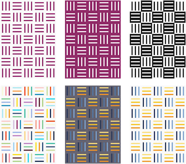
I’ve mocked up my Bar Quilt pattern using different colourways to show the effect. As you can see, even just reversing the colours of a two-colour pattern can make two quilts look quite different, yet still keep the cohesive feel you’re going for.
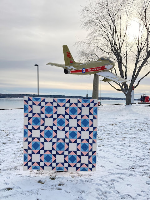
In this blog post here I show how my Victorian Tiles pattern gets a different look with different colour choices. There are even a couple of colour combinations that almost make it look like a different pattern.
Same Fabrics or Colour Scheme, Different Pattern
The flipside of that idea is to use two different patterns, but use the same colour scheme or the same fabric line. This is something that would work well, for example, for quilts for two beds in the same room, or for a couch quilt and a matching coffee table topper, or a series of throw pillows. Choosing the same fabrics or the same colour scheme will pull the overall look of the quilts together, even if the actual patterns are quite different.
Matching Design Elements
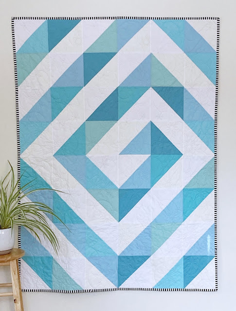
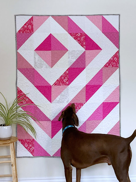
Choosing a matching design element can also give cohesion whether you choose the same types of fabrics or different ones. Design elements are things like the use of curves vs. straight lines, HSTs, small or large blocks, etc. My Ripple & Swirl quilt pattern is a great example of that. The pattern uses simple HSTs, but they’re set in different layouts to make either the Ripple look, or the Swirl.
I’ve made both options in similar colour schemes, using white and a pastel colour, and while neither the colours nor the layout actually match, the quilts look like they definitely belong together. Something like this pattern would be perfect for sibling quilts again, or twin babies, whether you go with the traditional blue and pink for boys and girls, or choose different colours.
Design Your Own Quilt Series
If you’d prefer to design your own matching set of quilts, grab a pencil and some graph paper and start doodling. Focus on one design element (like I mentioned above, those are things like straight lines, triangles, curves etc.) and then see what sort of variations you can come up with. Change their size or overall shape, repeat them, turn them, flip them, and see what patterns come out, or what ideas it might give you.
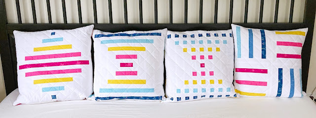
That’s how I developed my Bar Quilts series, even though I didn’t set out to design a series at all, but rather just played around with placement and scale to see what would happen.
I originally started with a simple striped quilt, and then played around with the thickness and length of the stripes until I arrived at the design that became Raise The Bar.
Spinning Top is simply the inversion of that same design, and Staccato is the “morse code version” of it 🙂
For Bar Code, I went back to my original striped design and shrunk it down to a block size. I played around with the number, width and length of the stripes, turned blocks this way and that way, until I liked the looks of it. Bar Code looks different from the rest of the series, but in a sense it is actually closest to the original striped design.
All four of these patterns come in a pillow size as well as the baby and throw sizes, so I turned them into my very own set of matching-but-not-quite couch pillows. I chose the same colours for each of them, adding an extra shade of blue for the Bar Code pillow because it uses six colours while the others only have five each. Then I picked four of the colours (yellow, dark pink, light pink, and dark blue) as the pillow backings. Seeing them all lined up on the couch, they all work together like they’re meant to despite the different patterns. But the matching colours and the stripe element in all of them add cohesion and make them look like a deliberate set.

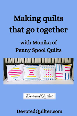

No comments:
Post a Comment
Thanks for taking the time to leave me a message. I love hearing from you.